

Understanding the Impact of Colour in Commercial Spaces
There’s a school of thought that suggests different colours can evoke different emotional responses in people. McDonald’s uses the colours red and yellow because these colours are said to stimulate appetite, happiness, and approachability. Some prisons are painted bright pastel colours like blue and pink, with the idea being that they have calming effects.
The colours used in an office environment and other kinds of workspace also have a profound impact. The colour of an office influences employee collaboration, productivity, and happiness. Colour is one of the most powerful but also most underutilized tools to create a great commercial environment. Here’s how to choose the right colours for your commercial redesign.
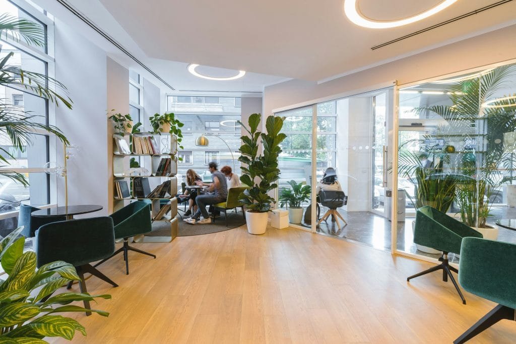
Reception Areas/Waiting Rooms
Your reception areas and waiting rooms need to create a welcoming first impression for visitors. These spaces should be decorated using colors that tie in with your branding, including your logo and corporate colors. You can soften the colors up a bit to be more welcoming if your corporate colors are bolder. Avoid creating plain white rooms as these feel uncomfortable and clinical. If you want to have neutral colors, then inject some personality using artwork and plants to create an excellent first impression. Shades like navy, charcoal, and forest green are a good choice for businesses that want to appear responsible and serious.
In the Office
Offices should be painting with cool colours such as blues and greens. These colours have a natural soothing effect and improve concentration and productivity while minimizing anxiety. It helps to keep balance in mind as you decorate. Going for an all-over blue goes from being relaxing to melancholic and depressing. Add some warm accents and elements to the room to keep productivity and energy levels up by adding a splash of orange or red. One way to get this look is to paint the walls blue and use bright furniture, paintings, and rugs to catch the eye.
Training Spaces
Blues are an excellent choice for training spaces, in particular turquoise. A turquoise is a good option because it improves communication and creativity. Yellow is also a good choice because it helps with information retention. Try to add sunshine to the space, such as by a whiteboard or projector screen, to help the training sink in.
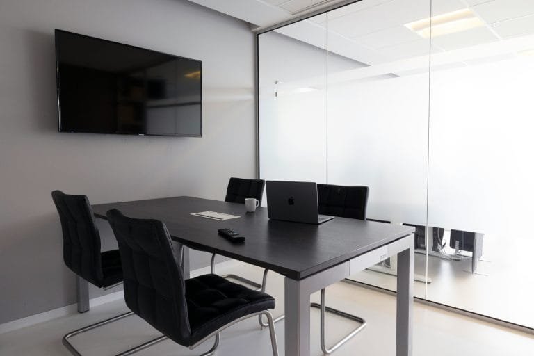
Meeting Rooms
Green is an excellent choice for meeting rooms. Green is considered the colour of concentration and collaboration. Include some green in boardrooms and meeting rooms to ensure things are done correctly.
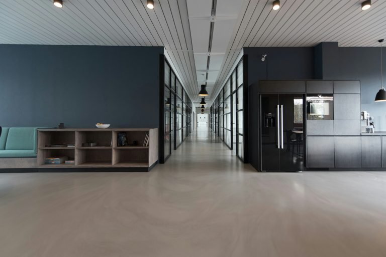
Break Spaces
Break spaces such as a kitchen, staff lounge, and hallway are the places to experiment a little more with colour. These are areas where you can showcase your vibrant and whimsical side without getting in the way of productivity. From an orange kitchen to a purple hallway, small break spaces are made for playful choices that make people feel more optimistic and energetic. This is your chance to have some fun with decorating, so don’t be afraid of a little experimentation.